Back to Blog

10 Ways to Optimize Your Product Pages for Higher Conversions

Content testing

A/B Tests

AOV

Oct 21, 2025

15 min. read

Vivian

Your product page is often the make-or-break moment in the buying journey. Shoppers might click on your ads, browse your collections, and add items to cart, but if your product page doesn’t build trust, answer questions, and remove hesitation, you won’t see that cart turn into a purchase.

That’s why your product page needs to be optimized to guide potential customers seamlessly from interest to action, showing value, reducing friction, and making buying feel like the obvious next step.

In this guide, we’ll break down the anatomy of a high-converting product page and share actionable strategies you can apply right away to lift conversions without increasing ad spend.

Anatomy of a high-converting product page

A high-converting product page guides your visitor until purchasing feels like the obvious choice. Every element has a role, and if you miss one, you risk losing sales.

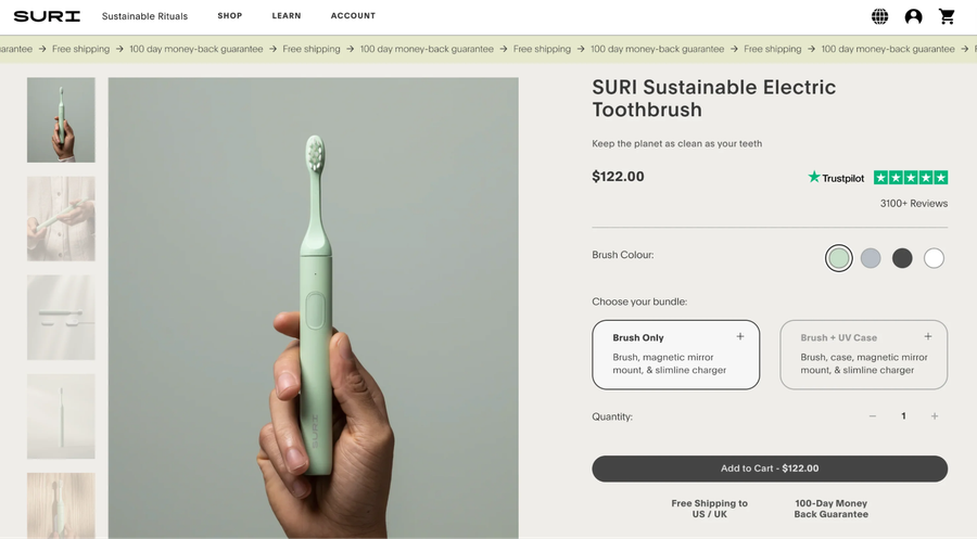
Here’s the complete breakdown of the core elements of a high-converting product page:
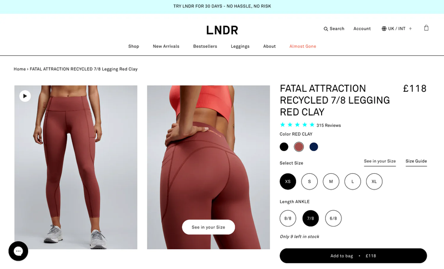
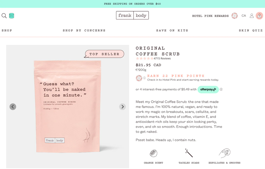
Core visuals: Show before you tell

  • Add clear, high-quality images that show every angle, with zoom functionality for details.
  • Display all variants (colors, sizes, styles) without requiring extra clicks.
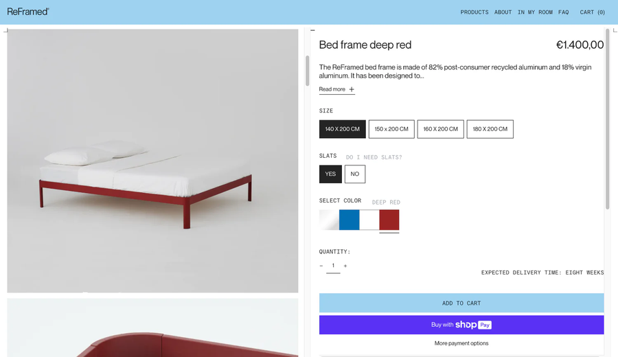
  • Add short product videos (under 45 seconds) demonstrating real-life use, not just polished studio spins.
  • If your product has details or looks different when viewed at different angles, add a 360° view.

Product descriptions: Explain without overselling

  • Start with a clear product name and one-line subheading that explains what the product is and its value.
  • Write a benefit-driven description. Instead of “100% cotton,” write “100% cotton for breathable comfort in humid weather.”
  • Use bullet lists to explain specific product details like measurements, weight, compatibility, materials, ingredients, or product features. Make scanning effortless.

Conversion triggers: Remove friction

  • Show price and discounts upfront. Never make someone scroll to find it.
  • Place a primary CTA button (Add to Cart/Buy Now) above the fold, and repeat it after reviews and FAQs. Keep it one clear action.
  • If you use urgency cues (low stock, shipping countdown), be honest about it. Fake scarcity kills trust.
  • Position trust badges, guarantees, and secure checkout icons directly beside CTAs, right where hesitation happens.
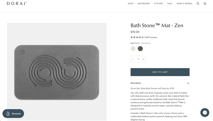
Social proof: Include customer reviews 

  • Feature reviews with photos and videos to show the product in real life.
  • Display average ratings directly under the product heading so shoppers see credibility immediately.
  • Highlight specific testimonials that answer buyer concerns (fit, quality, speed of delivery, and comparisons to alternatives).
  • Include authentic user-generated content (UGC), such as Instagram reels, tagged posts, or unboxing shots embedded directly.

User experience: Make the page effortless

  • Prioritize mobile optimization, testing for page load, layout, and ease of navigation. 
  • Your page’s load speed must be under 3 seconds on mobile devices.
  • Design for thumb navigation: sticky Add to Cart, large tap areas, and no cluttered pop-ups.
  • Include breadcrumbs and back-to-category links so visitors don’t feel stuck.

Supporting sections: Answer doubts before they leave

  • Use comparison charts to help buyers choose between models or bundles.
  • Share FAQs covering objections, like shipping time, return window, sizing fit, and warranty.

Search engine optimization: Drive organic traffic by creating visibility 

Search engines remain one of the biggest drivers of qualified traffic, and optimizing your product pages for SEO ensures buyers find you when they’re already searching with intent.

Here’s how to optimize product pages for SEO:

  • Write keyword-rich meta titles and meta descriptions. Titles should include product type, brand, and a core keyword, while descriptions should highlight benefits and a CTA.
  • Use keyword-focused headings and product names that match buyer intent. For example, “Organic Cotton Crewneck T-Shirt – Breathable Summer Wear”.
  • Write unique product descriptions. Never duplicate supplier copy, as it hurts rankings.
  • Add alt text to images so search engines understand your visuals and shoppers with accessibility needs benefit.
  • Use clean, descriptive URLs (/mens-running-shoes/ultra-light-blue) for readability and ranking.
  • Include schema markup (Product, Review, Price, Availability) to improve click-through rates with rich snippets.
  • Add internal links to related categories, bundles, or educational content to increase visibility and keep visitors engaged.

10 Product page optimization strategies for higher conversions

The product page is where shoppers evaluate, compare, and decide if they should buy. If this landing page doesn’t deliver clarity, confidence, and complete information, they’ll leave, often to a competitor who does.

Small, targeted optimizations can lift conversions significantly without increasing ad spend. Here are 10 strategies to maximize your product pages.

1. Add social proof with customer reviews and UGC

Shoppers trust other people more than they trust brands. Reviews and user-generated content (UGC) don’t just add credibility. They directly impact sales. 

In fact, displaying reviews can increase conversion rates by up to 120%.

Here’s how to incorporate them into your product pages:

  • Place star ratings directly under the product title, where buyers naturally look first.
  • Ask and collect images and videos from customers you have bought your product since these will be more persuasive to visitors than text alone.
  • Pin reviews that mention specific outcomes like fit, durability, or delivery speed, because these details answer real buyer concerns.
  • Embed authentic UGC from social channels to show your product used by people who loved it enough to share it on social media.

2. Optimize pricing

Due to changing user behavior, seasonal demands, competitor moves, and even economic changes, pricing is never fixed. 

But, how do you know what the right pricing strategy is? Here’s how you can strategically go about it:

  • Run A/B tests on different price points to find the sweet spot between volume and margin.
  • Show the original price with a strike-through to anchor discounts and make savings obvious.
  • Monitor competitor pricing regularly, because buyers almost always compare before deciding.
  • Offer bundles or tiered pricing to increase average order values, for example, 'Buy 2, save 10%.'

Want to see which pricing offer works best for your business? Read our blog on Price Testing for Shopify Brands.

3. Include critical information like size charts and FAQs

Confusion kills conversions. If buyers can’t confirm sizing, compatibility, or delivery timelines, they’ll abandon the page.

Here’s how to solve it:

  • Include detailed size charts with measurements.
  • Add comparison charts to show differences between multiple models or variants. 
  • Place a frequently asked question (FAQ) section near the CTA to handle objections (shipping time, return policy, compatibility).

4. Identify drop-off points and plug the gaps

Most online stores lose customers due to predictable reasons like unclear product info, slow-loading images, or poorly placed CTAs. Heatmaps and session recordings expose those hidden friction points by showing where buyers pause, scroll past, or exit. 

Instead of guessing, you can pinpoint where the page loses attention and set up targeted fixes that directly lift conversions.

Here’s how you can act on these insights:

  • Track scroll depth to see if visitors reach critical sections like reviews or FAQs.
  • Use click maps to spot wasted clicks on non-clickable elements (a sign that buyers expect more info).
  • Watch session replays to see how potential buyers navigate. This will help you find friction points like when a shopper gets stuck at the size chart or what causes them to hesitate at checkout. 

5. Add personalization and dynamic recommendations

A generic product page that doesn’t relate to its target audience will see high drop-offs. Personalization confirms to shoppers that the product and brand they are engaged with is designed for their specific needs and interests. 

According to research, 70% of consumers say it’s important for brands to create personalized experiences. But most ecommerce businesses only scratch the surface.

Here are a few ways to include personalization on your product pages to guide buyers toward the right choice faster. 

  • Explain the problem that the product will solve for them, using conversational language and storytelling.
  • Highlight shipping times or promotions specific to a shopper’s location.
  • Show “Bestseller,” “Trending,” or “Back in Stock” tags dynamically based on customer interest.
  • Place “Recently Viewed” widgets at the end of the product page for returning visitors to easily jump back in.
  • Test cross-sell widgets that suggest complementary items (“Pair it with…”) to boost average order value.
  • Rotate recommendations based on behavioral triggers: first-time visitors see bestsellers, while browsers see items they interacted with earlier.
  • Use upsell blocks to showcase higher-value versions, bundles, or premium tiers (“Upgrade to the XL for 30% more capacity”).
  • Keep testing formats (carousels vs. grids) and measure CTR and conversion impact, not just clicks.

6. Include immersive experiences 

Flat photos no longer cut it when shoppers want confidence before buying. AR and visualization tools bridge that gap by letting buyers see how products fit into their lives. 

According to reports, products with AR content convert up to 94% better than those without, offering realistic and accessible visual experiences to help make an informed decision.

Here’s how you can include immersive experiences on your product pages:

  • Add 360° image spins for items that need detailed inspection (tech, accessories, décor).
  • Use AR view-in-room options for bulky items like furniture or appliances.
  • Offer virtual try-ons for fashion, eyewear, or cosmetics to reduce returns.
  • Test interactive zooms and swatches so buyers see texture, detail, and variant differences without leaving the page.

7. Offer live support

Even the most detailed product page won’t answer every buyer’s question. Sometimes visitors hesitate because they want instant clarification on delivery, sizing, or warranty. Live chat bridges that gap by turning uncertainty into a confident purchasing decision in real time.

Reports show that 44% of online consumers say having questions answered by a live person during a purchase is one of the most important features a site can offer.

Here’s how you can implement live support effectively:

  • Add a live chat widget that’s visible but not intrusive.
  • Use proactive triggers like “Need help choosing a size?”
  • Train support to focus on pre-purchase questions (delivery, returns, fit).
  • Create documentation with common questions and answers so that your support team can reference information easily and share it quickly.
  • Use tools like Tidio or Gorgias to manage real-time conversations across channels.

8. Include shoppable videos

Shoppers are already familiar with scrolling through short videos on Instagram and TikTok. Bringing that same experience to your product page keeps them engaged and shortens the buying journey. 

Shoppable videos let visitors watch a product in action and purchase directly from the video by blending discovery with purchase. Brands using video see higher conversions because the product feels ‘real’ in motion, not static.

To make shoppable video work on your pages,

  • Place short, scrollable video reels that mirror familiar social media behavior.
  • Add clickable product tags inside the video so buyers don’t leave the page to hunt for items.
  • Use tools like Tolstoy, Videowise, or Firework that specialize in shoppable video integration.
  • Keep videos under 60 seconds and focused on real use cases, not polished ads.

9. Improve 'add to cart' experience

The Add to Cart button is your conversion gateway. If it’s buried, hard to tap, or poorly worded, you create unnecessary friction. 

Here are a few best practices to improve your CTA:

  • Place your CTA above the fold so buyers see it without scrolling.
  • Add a sticky “Add to Cart” bar on mobile to keep it visible while they browse details.
  • Use clear, action-driven copy ('Add to Cart' or 'Buy Now') instead of vague terms like 'Proceed' or 'Submit.'
  • Test color, size, and contrast to make the CTA stand out without clashing with design. Visibility alone has proven to lift CTRs by 90%.

10. Use A/B testing to understand what maximizes results

A/B testing removes guesswork, giving you proof of what changes drive real results among your site visitors. 

Real-time split testing tools like ABConvert let you test variables (from price to layouts to copy). You learn what truly drives sales, and not just what you assume is good. 

Here's how you turn insights from your A/B tests into action:

  • Change one element at a time (headline, image, CTA text) to identify clear cause-and-effect.
  • Test high-impact elements first (product images, pricing layout, CTA placement, or trust signals) to move the most important metrics.
  • Let tests run until they reach statistical significance before declaring a winner.
  • Create split tests that show version A or B to different visitors on the same URL, then track outcomes in real time.

For example, a German jewelry brand tested showing an image preview of a personalized upload versus just the file path. This simple change led to a 5% uptick in checkout rate and an 8% rise in overall order completion.

Ready to increase conversions from your ecommerce product pages?

Your product page is where buyers make the final decision. Every detail matters, from images to trust signals to the CTA, A well-optimized page reduces friction, builds confidence, and makes purchasing feel effortless. 

But optimization isn’t a one-time task. Markets shift, shopper behavior evolves, and what worked last month may not work today. That’s why A/B testing is essential. Instead of relying on guesswork, you can run controlled experiments and let real customer data guide your strategy, showing you exactly which headline, layout, or price point drives the most conversions.

If you’re looking for a tool that lets ecommerce stores run A/B tests, ABConvert is built for it:

  • Price testing to find the perfect balance between sales volume and margin.
  • Theme and layout testing to optimize CTAs, page structure, and design.
  • Real-time analytics that reveal exactly which version performs better—and why.
  • No-code setup so you can launch experiments in minutes, not weeks.

Want to see how ABConvert can help you maximize conversions on your product pages? Book a demo!

Start your 14-day free trial and see how ABConvert can maximize conversions on your product pages.