Logo
The logo is the primary identifier of our brand. It is employed to quickly communicate our name and identity to the world.


Download
On Color
When combining the logo with brand colors, always ensure there is ample contrast in color pairings. The following examples are approved combinations.
Color

Color

Monochrome

Monochrome

Color

Color

Monochrome

Monochrome

For Color & Monochrome

For Color & Monochrome

Clear Space
Don’t crowd the logo. When placing other elements nearby, ensure minimum clear space for brand consistency.


Co-branding lock-up
Please maintain the same 1/2x distance between ABConvert’s logo and other logotypes or elements. It is also important to optically align the partner logos – this makes the composition neater and visually balanced.

Don’ts
Do not diminish the value of the logo in our brand. Avoid the following treatments.

Don’t stretch

Don’t outline
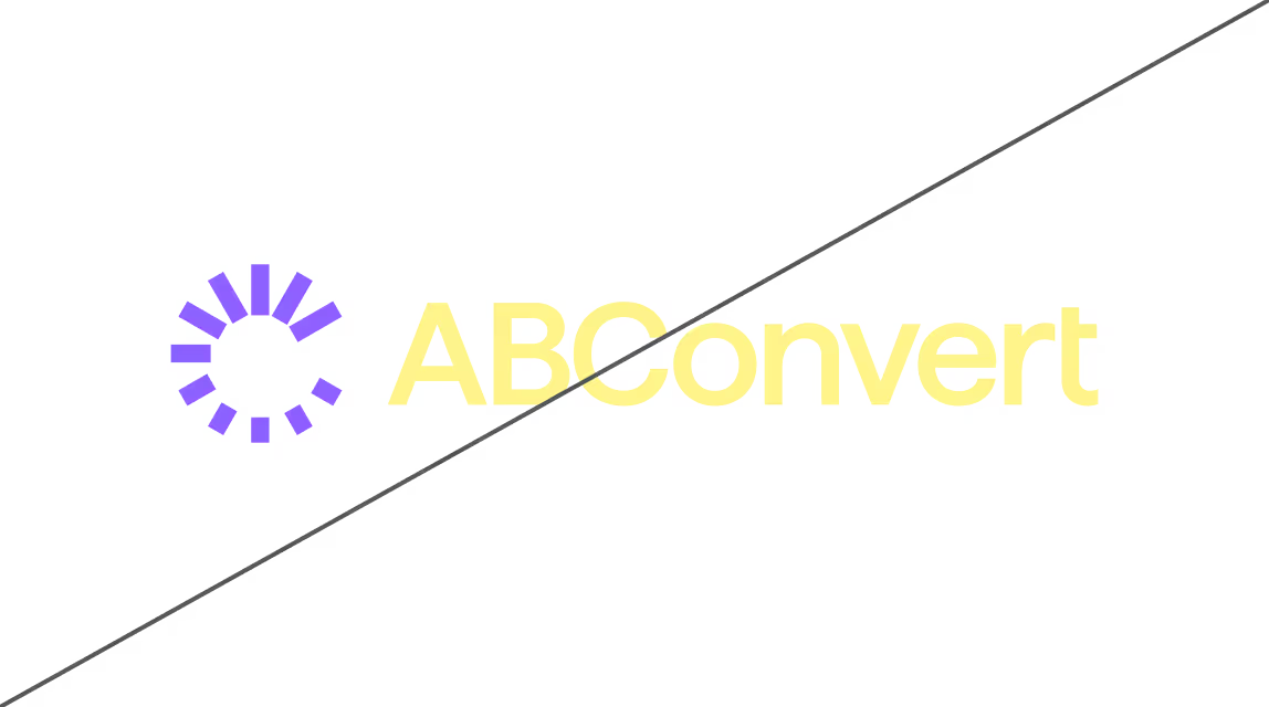
Don’t use unrelated colors

Don’t apply shadows or effects

Don’t rotate

Don’t apply patterns

Don’t use a coloured version of the logomark designed for a light background on a dark background
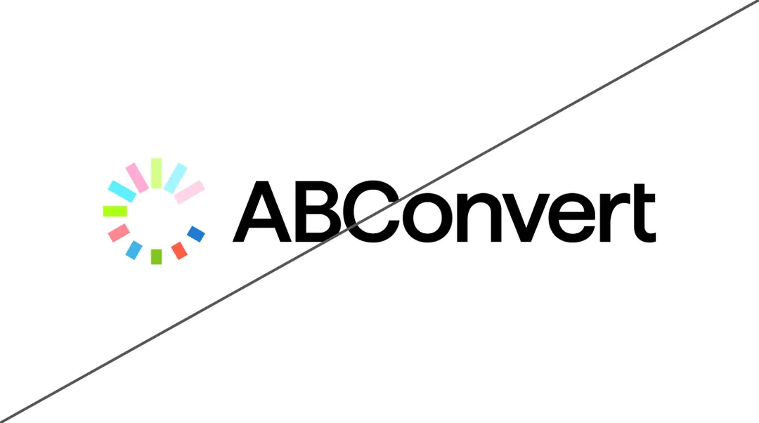
Don’t use a coloured version of the logomark designed for a dark background on alight background

Don’t use colored backgrounds — whether brand colors or any other. The logo should be placed on a clean, neutral background
Color palettes
The brand's palette consists of shades of blue, green and coral, which are combined with each other and with a basic monochrome palette.
ABC Coral 01
HEX:
#FF5F47
ABC Coral 02
HEX:
#FF8690
ABC Coral 03
HEX:
#FFABD6ABC Coral 04
HEX:
#FFD4EAABC Green 01
HEX:
#5A912B
ABC Green 02
HEX:
#82C621
ABC Green 03
HEX:
#ACFF17
ABC Green 03
HEX:
#D6FF8C
ABC Blue 01
HEX:
#217BD1
ABC Blue 02
HEX:
#3FB4E8
ABC Blue 03
HEX:
#5DEFFF
ABC Blue 04
HEX:
#A4F6FF
ABC Dark Gray
HEX:
#3C3C3C
ABC Medium Gray
HEX:
#4E4E4E
ABC Pure white
HEX:
#FFFFFF
ABC Coral 01
HEX:
#FF5F47
ABC Coral 00
HEX:
#DF2016
ABC Coral 02
HEX:
#FF8690
ABC Coral 03
HEX:
#FFABD6ABC Green 01
HEX:
#5A912B
ABC Green 00
HEX:
#2A800D
ABC Green 02
HEX:
#82C621
ABC Green 03
HEX:
#ACFF17
ABC Blue 00
HEX:
#085CC3
ABC Blue 01
HEX:
#217BD1
ABC Blue 02
HEX:
#217BD1
ABC Blue 03
HEX:
#5DEFFF
ABC Dark Gray
HEX:
#3C3C3C
ABC Medium Gray
HEX:
#4E4E4E
ABC Pure white
HEX:
#FFFFFF
Fonts
Typography works in a monofont solution, using one font family. For headings and main text, the Haffer font is used in 2 styles.
Abc
For accents
Font
Haffer
Styles
Medium
Scale your success,
one test at a time
one test at a time
For texts
Font
Haffer
Styles
Regular
Unlock your business growth with actionable insights
123
Download
Graphics
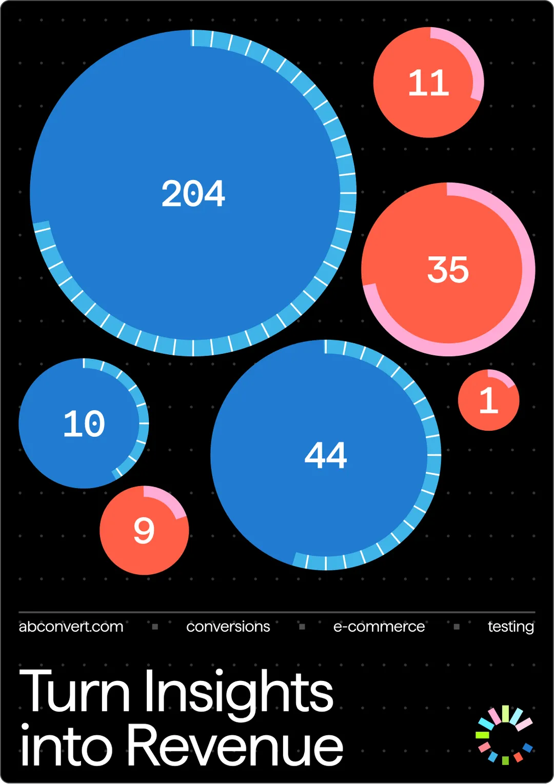
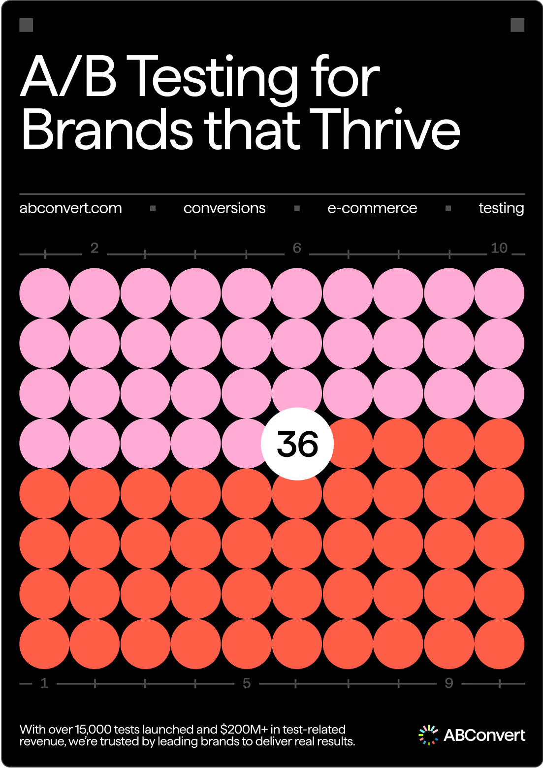
The style uses graphic elements in the form of analytical graphs and tables consisting of round and columnar elements.


Best Practices
Below are some of the best examples of style and graphic application in layouts.

Icons
A set of icons that continue the character of the identity are used for navigation and to complement the layouts.


Download
Accents
For buttons and additional plates, rotate the elements at an angle of 3 degrees to create emphasis on the layout.


Don’ts
Do not diminish the value of the logo in our brand. Avoid the following treatments.

Don’t deform the elements

Don't glue the elements together

Don’t use unrelated colors

Don’t use unrelated colors

Don’t outline

Don’t apply shadows or effects
