
Introducing ABConvert's new analytics dashboard for Shopify A/B testing
ABConvert's new analytics dashboard makes test results easier to understand, compare, and trust, with consistent metrics, breakdown dimensions, faster loading for large stores, and recomputable results when metrics improve.

Introducing the new ABConvert Analytics: clearer results for every test
When you run an A/B test, the dashboard should help you answer one thing: which version should I choose?
That answer is not always obvious. A variant may bring in more revenue but fewer orders. Another may get more clicks but no clear lift in checkout completion. A test may look strong overall, then behave differently on mobile, in one country, or for returning visitors.
So the new ABConvert Analytics is built around a simple idea: make every result easier to understand before you make a decision.
The new dashboard gives each metric a clearer definition, lets you break results down by more visitor and traffic details, and loads much faster for large stores. It also gives ABConvert a better way to fix or improve metric calculations without asking you to restart a test just to get trustworthy numbers.
This is not only a visual update. It changes how ABConvert prepares, explains, and compares your test results.
01What you can do with the new analytics dashboard
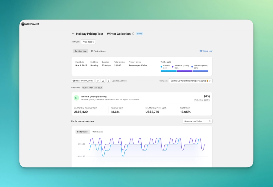
With the new ABConvert Analytics, every test type now follows the same reporting structure. Price tests, shipping tests, template tests, theme tests, URL redirect tests, checkout tests, and visual editor tests are easier to read side by side.
Here is what changes for you:
| What you care about | What changed |
|---|---|
| Understanding metrics | Each metric has one clearer definition across test types |
| Comparing different tests | Test results use the same reporting structure, so comparisons are less confusing |
| Fixing metric issues | When a tracked metric is corrected, ABConvert can recompute past results without making you restart the test |
| Reading engagement | Metrics like click-through, time on page, and bounce behavior are available across test types |
| Reading product results | Product-level results are available across test types, not only price tests |
| Finding segment differences | You can break results down by built-in dimensions and combine any two |
| Loading large reports | Large-store dashboards load much faster, about 1 second in our benchmark |
02One metric should not mean five different things
The most important improvement is also the easiest to miss: the same metric now means the same thing everywhere.
In the old analytics dashboard, reports were built separately for each test type. That meant a metric label could be familiar but still behave differently depending on where you saw it. For example, "conversion rate" or "visitors" might be calculated one way for a price test and another way for a shipping test.
That creates a real problem for users. If two reports use the same words but calculate them differently, you may think you are comparing the same thing when you are not.
The new analytics dashboard fixes this by giving metrics one shared definition across test types.
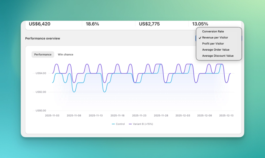
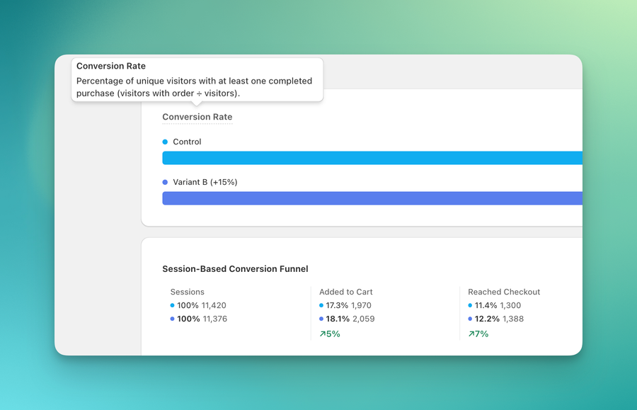
Conversion rate means the same thing whether you are looking at a price test or a shipping test. Visitors, sessions, orders, revenue, and average order value are easier to interpret because they follow the same reporting logic.
It also separates ideas that used to be hidden inside one label. For example, there is a difference between:
- visitors assigned to a test
- sessions that reached checkout
- shoppers who completed checkout
- confirmed orders and revenue
Those are not interchangeable. The new dashboard makes those differences easier to see, so you do not accidentally read one number as another.
03Why old and new numbers may not match exactly
Some users will compare the old dashboard and the new dashboard and notice that numbers do not always match exactly.
That can be uncomfortable, so it is worth explaining clearly: a difference does not automatically mean data was lost, and it does not automatically mean one version is wrong.
The new dashboard may use a clearer metric definition, a different denominator, or a different filter. It may also separate visitor behavior, session behavior, checkout behavior, and confirmed orders more clearly than before.
For example, a rate based on assigned visitors can look different from a rate based on sessions. A revenue metric that uses confirmed order data can look different from a metric based only on storefront behavior. Both numbers may be useful, but they answer different questions.
This is one of the reasons we changed the analytics system. The old version could make these differences harder to see because each report had more of its own logic. The new version is designed to make the measurement basis clearer, even when that means the number is not identical to what you saw before.
When reviewing a result, start with the metric definition. Once you know what the number is measuring, the result becomes much easier to trust.
04If a metric is corrected, you should not have to restart your test
This is one of the biggest practical changes.
In the old analytics version, if a metric was defined or calculated incorrectly, fixing the number could be painful. In some cases, getting a clean result meant collecting data again or re-running the test.
That is frustrating. It costs time, traffic, and patience.
The new analytics system keeps more of the measurement context needed to recompute results. So when ABConvert corrects a metric or adds a new breakdown for something already being tracked, we can often update past results without asking you to restart the test.
For example, if ABConvert is already tracking page views, cart events, checkout steps, or orders, a new metric or breakdown based on that existing data can appear on existing tests once the analytics layer supports it.
This does not mean every historical detail can always be recovered. If something was never tracked, no dashboard can recreate it later. But when the required data exists, the new analytics system gives us a much better way to correct and improve results over time.
For users, the benefit is simple: your experiment history becomes more useful and less fragile.
05See more than the overall winner
An overall result is useful, but it can hide important differences.
A variant might win on desktop but lose on mobile. It might work well for returning visitors but not for first-time visitors. It might perform better in one country, one traffic source, or one campaign.
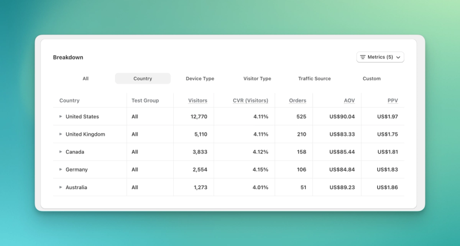
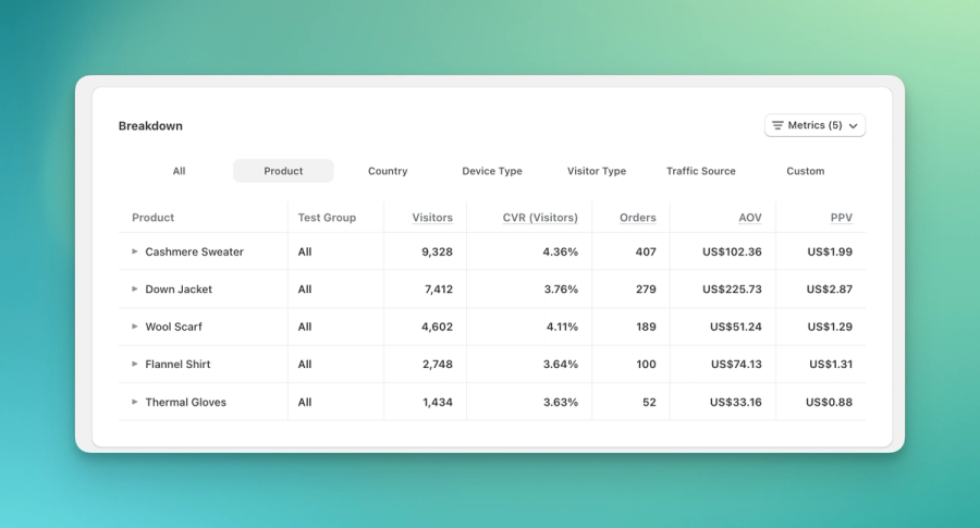
The new analytics dashboard lets you break results down by 17 built-in dimensions, including country, device, new vs. returning visitor, traffic source, and more. You can also combine any two dimensions.
That helps you answer questions like:
- Did this variant win across most traffic, or only one segment?
- Is mobile behaving differently from desktop?
- Are paid visitors reacting differently from organic visitors?
- Is one market responsible for most of the result?
- Does the lift still hold when you separate new and returning visitors?
This is especially useful when a test result looks surprising. Instead of guessing why the number moved, you can inspect where it moved.
06Every test type gets richer metrics
The old analytics dashboard did not give every test type the same metric coverage. Some engagement and product-level metrics were only available in specific reports.
The new dashboard brings the full analytics set across test types:
- conversion metrics
- revenue metrics
- average order value
- statistical significance
- engagement metrics such as click-through, time on page, and bounce behavior
- product-level results
This makes reports easier to learn because you do not need to remember which test type supports which metric. It also makes test review more useful.
For example, a visual editor test is not only about orders. You may also want to know whether users clicked more, stayed longer, bounced less, or interacted with products differently. A checkout test is not only about checkout completion. You may also want to understand revenue, order value, and segment performance.
The new analytics dashboard gives you more ways to understand what happened before deciding what to ship.
07Faster reports for larger stores
For large stores, speed matters. If every dashboard view takes several seconds to load, reviewing tests becomes slower than it should be.
In our benchmark from a large store with about 190,000 visitors per test, the old dashboard typically loaded in around 3 seconds and could take up to 7 seconds on slower loads. The new dashboard loads in about 1 second.
Small stores under roughly 5,000 visitors were already fast, so they may not feel much change. The improvement becomes more noticeable as your traffic grows.
The user-facing result is simple: less waiting, especially on large tests.
08Ready for AI workflows and MCP
The new analytics structure also makes ABConvert easier to use with AI workflows and MCP.
Because every test type now reports the same metrics with the same definitions, software can read the results more reliably. An assistant does not need custom logic for every test type just to understand what "conversion rate" or "revenue per visitor" means.
For example, you could ask:
"Compare conversion rate and revenue per visitor across my last three tests, and tell me which one performed best."
The assistant can read the same metric definitions you see in the dashboard and compare results more directly.
This matters because analytics is moving from "open the dashboard and manually inspect everything" toward "ask better questions and let software help with the first pass." The new analytics foundation makes that possible without making the numbers harder for humans to understand.
09What to expect when you first use it
When you open the new analytics dashboard, start with three habits:
- Check the metric definition before comparing results.
- Use breakdowns when the overall result looks too broad or surprising.
- Expect some old and new numbers to differ when the measurement basis changed.
The new dashboard is designed to be clearer, but clearer does not always mean identical. In some cases, the new number is different because it is measuring the result in a more consistent way.
That is the point of the change.
ABConvert new Analytics gives you a cleaner way to read test performance, compare different experiment types, and understand why a result changed. The goal is not just faster reports or more metrics. The goal is better decisions.
When you choose a winning variant, you should know what the number means, where the result came from, and whether it is strong enough to act on.
That is what the new analytics dashboard is built for.

FAQ vs AI Chat On Ecommerce Product Pages: What To Use, Where To Place It, And What To Test
Compare FAQ vs AI chat on ecommerce product pages: when to use each, where to place them, and the exact A/B tests to run to lift conversions.