


Landing Page CRO in 2026: Best Practices That Actually Lift Conversion
Learn the landing page CRO best practices for 2026, from matching pages to traffic intent to testing offers, proof, and RPV before scaling.
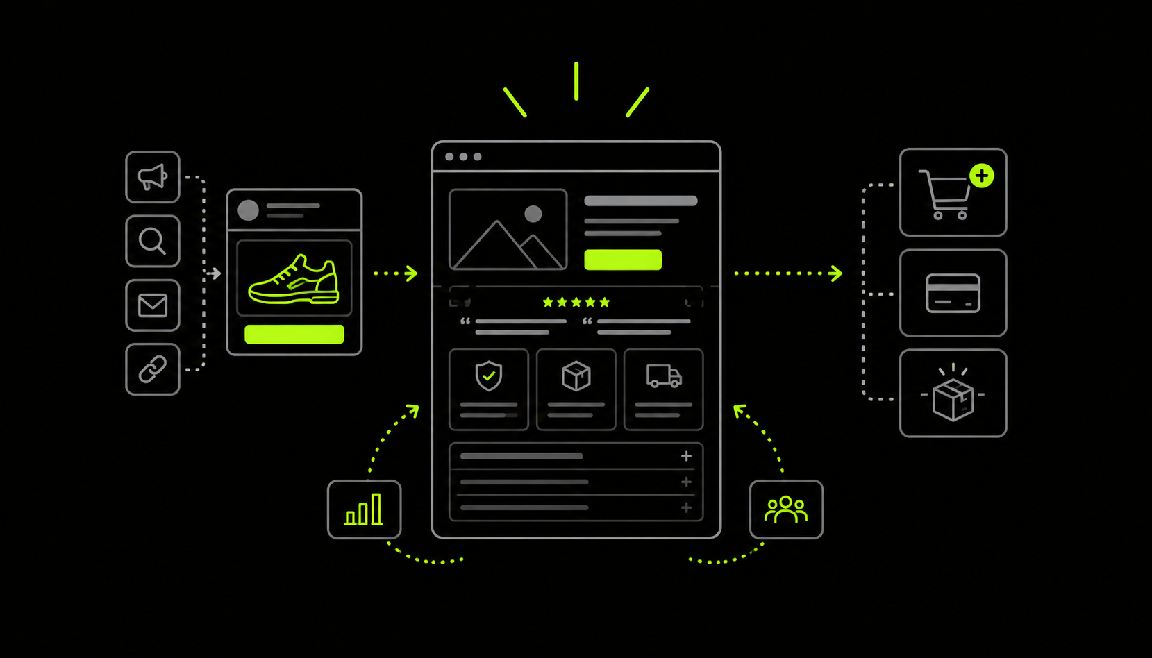
By the time a shopper lands on your site, they’ve often already researched the product. They may have compared options, read reviews, searched Reddit, browsed social content, or used AI tools to answer their questions.
Your landing page needs to pick up from there: reinforce what they already know, fill the gaps, and address what’s still keeping them from buying.
Jason Shepherd, founder of Snapshot, a CRO analytics app for Shopify, describes this as understanding where the customer is coming from, what they already know, and what they are still trying to confirm.
That makes the customer journey the starting point for landing page optimization. The experience should reflect where visitors came from, what they already know, and what they still need to confirm.
This guide combines insights from Billion Dollar Websites by Dylan Ander with our conversation with Jason Shepherd, who has 12 years of ecommerce and marketing experience, including several years in conversion rate optimization.
01Start with the customer journey, not the page
Before changing the headline, hero image, call-to-action (CTA), or layout, look at where the visitor comes from and what they already know.
Jason Shepherd's PACE framework gives you four parts of that context:
- Prognosis: The outcome the shopper expects
- Activity: What they’ve done so far
- Criteria: What they’re looking for
- Event: What prompted them to act
Use this to understand the situation that brought the visitor to your site and what they need to decide.
You do not need the same page for every visitor. A first-time visitor arriving from a cold ad has different information needs from a returning customer coming through email.
Align the ad to the page
Start with understanding what the product does for the customer. Jason groups products around three types of buying motivation:
- A problem to solve
- A pain point to relieve
- A promise the customer wants to achieve
That affects how you build the page.
A brand that sells a medical product should use their landing page to explain the problem they are solving and establish how and why the product addresses it.
A fashion brand selling summer dresses, on the other hand, will take a different approach because the purchase focuses on a promise: how the customer wants to look or feel.
“That's really going to shape the messaging, how you structure the layout of the website or of the product pages especially, you know, what landing pages you use, all of those things.”
— Jason Shepherd
The landing page should continue the argument that brought the shopper there. Use the product’s buying motivation to decide what that argument needs to communicate.
Match the page to the traffic quadrant
Once you understand the product's buying context, look at who is arriving and how they got there. Split your traffic into four quadrants: mobile devices, desktop, new, and returning.
Cold paid traffic and top-of-funnel SEO typically bring visitors into the new quadrants. Retargeting, email, and SMS tend to bring visitors into the returning quadrants.
Start with the quadrant that drives the most revenue and compare its performance with your historical data. The page should also carry the argument that brought the visitor there. If an ad makes a specific promise about a product, the landing page should continue that argument through the offer.
02Optimize the above-the-fold experience
The hero needs to establish the outcome and give visitors a reason to keep reading.
“If the Hero section doesn’t make them want to learn more (i.e., scroll down the page), they’ll bounce from the page, and you lose the sale instantly.”
— Billion Dollar Websites
Lead with the outcome, not the product description
What outcome does the shopper expect from the product? Make that the focus above the fold.
Use the headline to show what the customer wants to achieve and then explain the product and how it helps them through the supporting website copy.
“The customer is imagining what the outcome is going to be.”
— Jason Shepherd
Correct Toes' homepage shows how this can work. Their headline, “Getting people back on their feet for 25 years”, leads with the outcome while “25 years” gives the visitor a reason to trust the brand.
That credibility is an important factor when an $8 alternative sits beside a $65 product on Amazon.
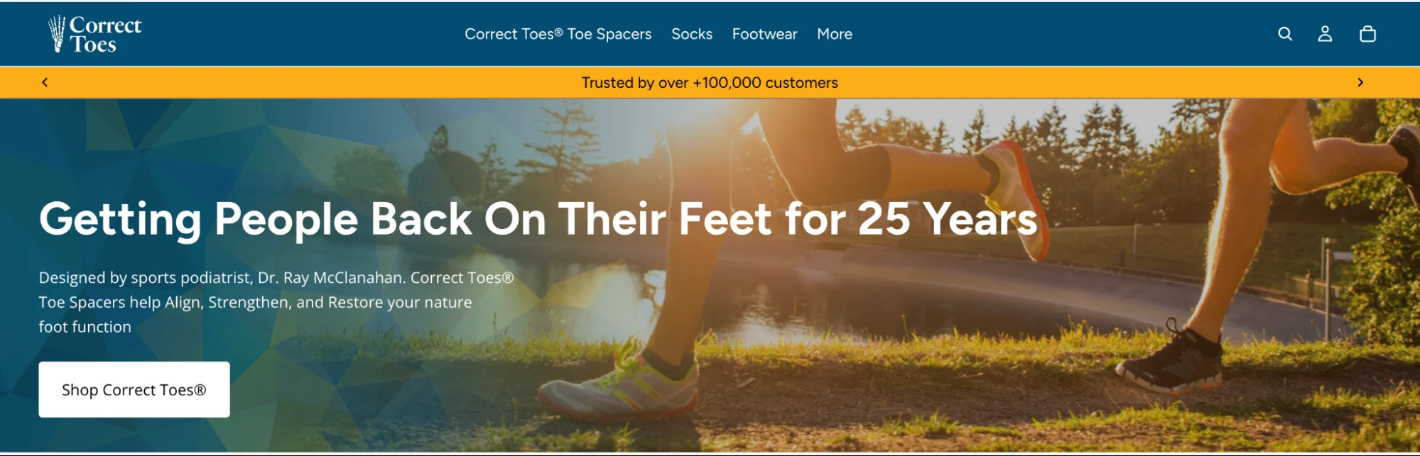
The headline doesn’t need to explain everything. It just needs to establish the outcome clearly enough that visitors know what the page helps them achieve.
Use copy and imagery to set the right context
For products that sell a promise, copy can do more than describe the product. It can help shoppers picture the situation they want to achieve.
Jason uses a summer dress to explain the difference. “Flower summer dress” describes the product. “You will feel amazing in our summer dresses” gives the shopper an outcome to picture. Seasonal details can sharpen that context further: “light breeze” suits early summer, while “cool, cozy” fits fall.
“So if I'm writing some copy, then I just want to make you imagine that situation, or take pictures in that situation.”
— Jason Shepherd
Use copy and a supporting image to establish the context, while keeping the product as the clearest element on the page.
Put the product in focus
Make the product the main element in the hero image. Strong visual hierarchy helps visitors identify the outcome, product, and key trust signals quickly.
“Make your product the Hero of the Hero Image.”
— Billion Dollar Websites
Show the product in use when the setting helps visitors understand the product, but keep the surrounding scene secondary.
“It’s a balance: Make the product the Hero, but show humans in context with the product.”
— Billion Dollar Websites
Use the 1-second test to evaluate the hero section
Test the hero before spending time on sections further down the page. Look at it for one second, then look away. Ask yourself:
- What stood out?
- What do you remember?
- Where did your eye go?
The test should tell you what the page communicates on first impression.
“The 1-Second Test is the best way to understand the first impression your website gives and how visitors will interpret your hero section.”
— Billion Dollar Websites
If the outcome or product does not register immediately, revisit the hierarchy of the headline, supporting copy, and image.
03Help customers make the right decision
At this stage, the shopper is trying to convince themselves to buy. The page needs to address whatever is still stopping them from thinking, “I want to buy it.”
“Now I'm on the website. It doesn't really matter what I did before; I'm ready to find out if this is the right product and to purchase. So content plays heavy in here.”
— Jason Shepherd
Find the questions customers still need answered
Customer service conversations can reveal the questions that are getting in the way of a purchase.
“I get a lot of feedback from our customer service person, who just says, ‘Hey, this is what I'm hearing, these are the problems.’ And then I can either fix it, or if it's something that I'm not totally sure about, then I will always AB test it.”
— Jason Shepherd
Post-purchase surveys are another useful source for FAQ topics.
“Post-purchase surveys are the number one place to draw inspiration for FAQ sections.”
— Billion Dollar Websites
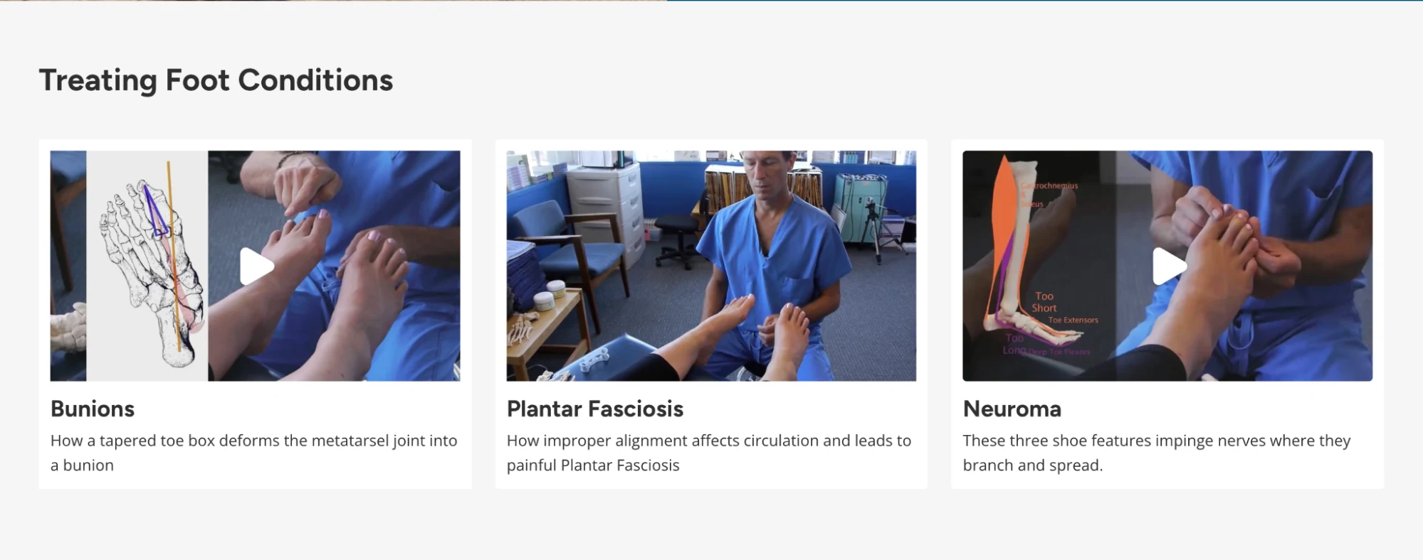
Use these questions to identify where the page needs more explanation or guidance. For example, Correct Toes added doctor-led videos covering common foot conditions and saw roughly a 15–16% increase in conversion.
Shoppers watched the videos, left for YouTube or the blog, and returned to the site to purchase. The videos had been filmed years earlier and still contributed to the buying experience.
The size of the lift also needs context. Large conversion lifts are easier to find on a new or neglected site, where obvious problems haven't been addressed yet.
Remove the decisions that create purchase friction
Start with what customers have already learned before they reach the page. Jason uses Reddit as an example.
“So, if I already found out what I need to know on Reddit, and I've already got to the page, I've reaffirmed everything that I need to know to say ‘this is the correct one,’ what else is stopping me?”
— Jason Shepherd
For Correct Toes, sizing was one of those remaining decisions.
Correct Toes sells toe spacers. Their “Find Your Size” tool asked shoppers about their foot condition and usual shoe size before recommending a size. When the tool was removed and replaced with a modal size grid, sales fell by roughly 30%.
Both versions provided the same sizing information. The difference was how much interpretation the shopper had to do themselves.
“It was the same information, both very easy to read, very fast, but one of them made people confident and one of them reduced confidence, because I left the decision up to themselves rather than saying, ‘Hey, we got you. We know what your problem is. Here's your answer.’”
— Jason Shepherd
The more important question is whether your page leaves an important purchase decision for the shopper to work out themselves. A size guide explains the options. A recommendation tool can tell the shopper which option fits their situation.
How to structure FAQs
Start with the questions customers actually need answered before buying.
- Find the questions: Use post-purchase surveys to identify the questions customers needed answered before buying.
- Prioritize the right questions: Use revenue per click (RPC) within your heatmap data to identify FAQ questions associated with revenue.
- Test FAQ placement: If an FAQ addresses an important purchase question, test its placement on the page.
“I’ve gotten some wild revenue increases through split testing FAQs and moving the FAQs up on Landing Pages.”
— Billion Dollar Websites
- Frame questions around reassurance: Use the question to surface the positive outcome the customer is looking for while keeping the full answer intact. Positive framing does not mean removing important information. You still need to disclose potential side effects and other negative impacts. For example:
- “What is your return policy?” → “What is your money-back guarantee?”
- “Are there any side effects?” → “How safe is XYZ product?”
04Place proof where customers need confidence
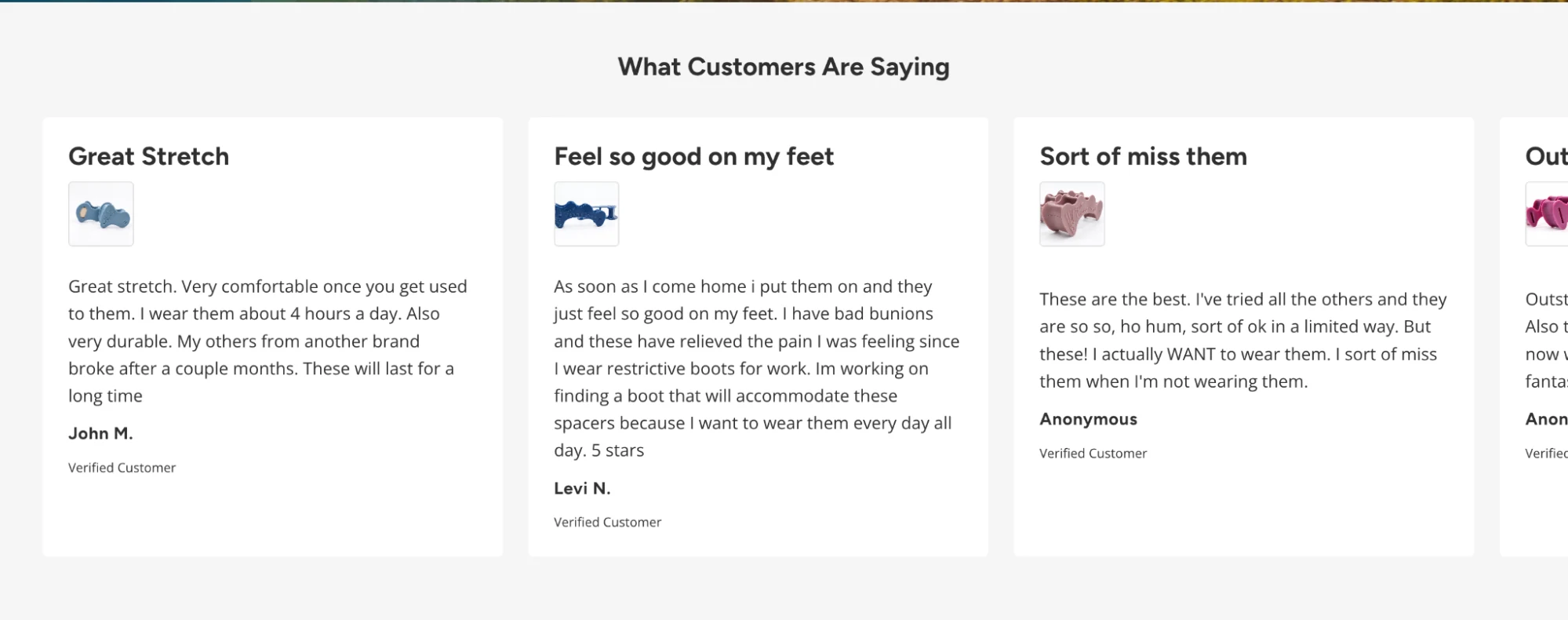
Proof works best when it helps shoppers resolve a specific concern. If someone is wondering whether a product can help with their condition, reviews from customers with the same condition are more useful than a generic testimonial.
Match proof to the shopper’s situation
The same product may need to answer very different questions depending on the shopper’s situation. Consider 6 shoppers with six different foot problems. The proof that helps one shopper decide may have little relevance to another.
Reviews from customers with the same condition can make the product more relevant to the person evaluating it. The same principle applies to educational content.
Correct Toes created videos on “Science of Foot Conditions” that address common conditions such as bunions, plantar fasciosis, and neuroma. The doctor-led videos gave shoppers more information about the problems they were trying to solve, and adding this content increased conversions by about 15–16%.
Together, this content gives shoppers evidence from two directions: someone with a similar problem used the product, and they can understand why the product is relevant to that problem.
Place proof beside the decision it supports
The same principle applies to where you place proof.
A review about fit is useful when someone is deciding whether the product will fit. A customer story about a specific use case is useful when someone is evaluating whether the product can solve that problem. An expert explanation can help when the shopper needs more information before trusting the product.
“And so when I'm on the product page, I need something to reiterate that this product will help me fix my bunion.”
— Jason Shepherd
Keep that evidence close to the claim or question it helps resolve. Testimonials don’t need to be placed in a single block at the bottom of the page.
Use reviews to show how others experience the product
Reviews give shoppers access to experiences the brand cannot provide through product copy alone. They can show how the product worked for someone with a particular problem, how it felt to use, or what happened after purchase.
This is why you need to place reviews on product pages.
“Social proof is anything that increases trust with customers via third parties that aren’t directly associated with your brand.”
— Billion Dollar Websites
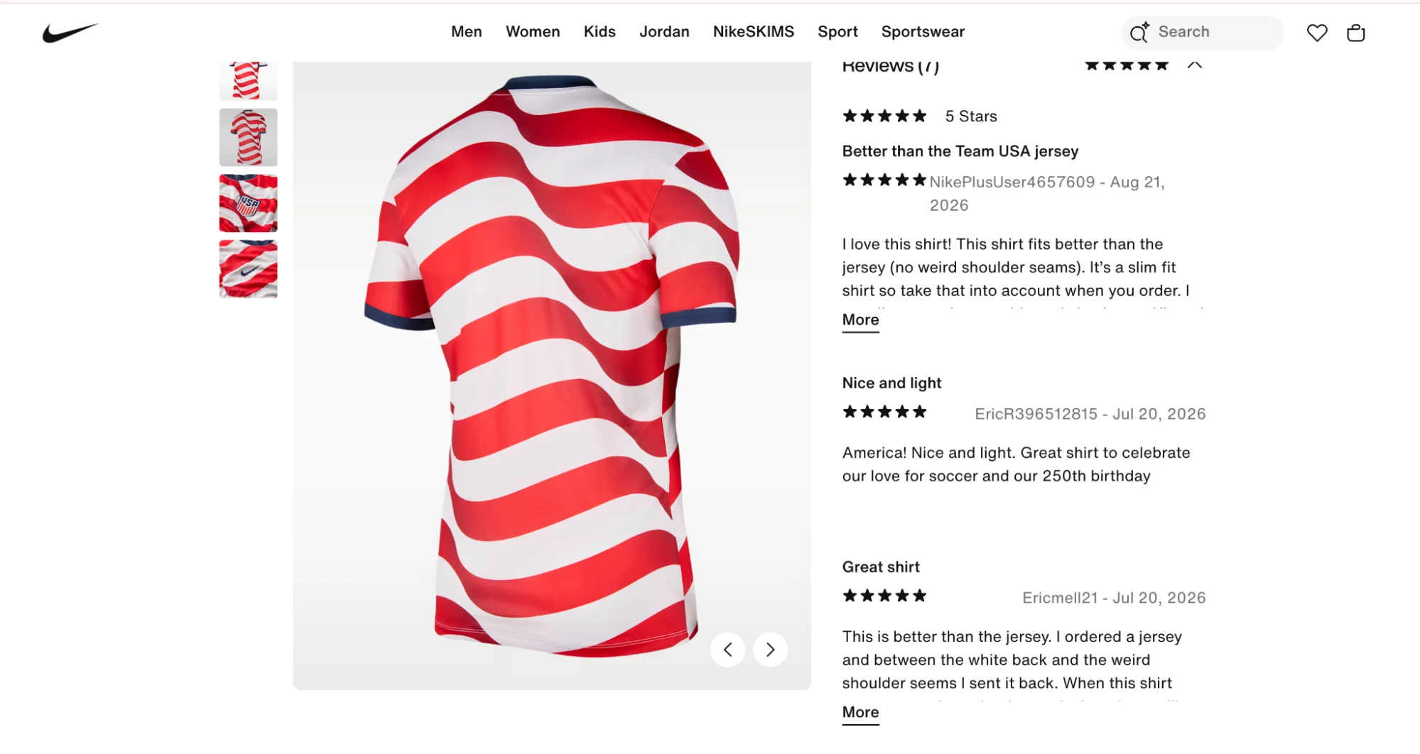
Nike, for example, places customer reviews alongside product information on their product pages. The reviews include customer comments about fit, giving shoppers information they can use as they evaluate the product.
05Make the path to purchase obvious
Once the page answers the shopper’s questions and provides enough proof, the purchase path should make the next step clear.
Make the offer easy to understand
Make the price and the value proposition of the offer clear. Shoppers should be able to see what they are buying, what they are paying, and what is included without having to figure it out from different parts of the page.
“Do not ‘bury’ your price, no matter how high the price is.”
— Billion Dollar Websites
Bundles, special pricing, and relevant add-ons can add value, but the offer should remain easy to understand.
“The more ‘unique’ the Offer is, the more compelling it will be, and the more users will see it as a great deal.”
— Billion Dollar Websites
Put Add to Cart above the fold on PDP landing pages
When a product page is being used as the landing experience, make the purchase action visible early. Shoppers who are ready to check out should have a clear path to “Add to Cart” as soon as they land.
“Most marketers have heard it is important to get your Add to Cart button above the Fold. It’s not always true … but in the case of PDP Landing Pages, it is absolutely true.”
— Billion Dollar Websites
For products that require more consideration, the page can provide more information before the buying section. The amount of content should reflect how much information the shopper needs before deciding.
Keep the price visible
Make the price easy to find, even when the product is expensive.
“Do not ‘bury’ your price, no matter how high the price is.”
— Billion Dollar Websites
If you use bundles or special pricing, keep the costs transparent and easy to understand.
Don't add urgency when the purchase isn't urgent
Urgency needs to fit the product and the buying situation. On the Correct Toes homepage, having 2 discount pop-ups each reduced conversion by roughly 10–15%. Sign-ups were around 1.5–2%, compared with the 8–10% rate expected elsewhere.
The discount was devaluing the product rather than helping shoppers resolve the questions that were preventing them from buying.
When scarcity is genuine, it can be useful.
“The key to using scarcity well is to be as genuine as possible. Customers can sense when you’re trying to manipulate them, and you will lose their trust.”
— Billion Dollar Websites
06Choose the right landing-page format for the product
There is no single landing-page format that works for every product. A failed test doesn’t mean that the format itself is wrong. Look at what the test actually changed and where shoppers dropped out.
For example, a sticky Add to Cart test increased Add to Cart activity without increasing purchases. The test improved an action on the page, but it didn't address the factors stopping shoppers from completing the purchase.
The issue could be further down the product page, where shoppers still need information or reassurance before buying.
“I frequently hear, ‘We tried an XYZ type of Landing Page, and that type of Landing Page doesn’t work for our brand.’ This is simply not true. Most of the time, it means you tried that type of Landing Page, but you probably didn’t execute it effectively.”
— Billion Dollar Websites
Choose the format based on what the customer needs
The format you use for your landing page depends on the product, the buying decision, and the customer need. Start with the product and the buying decision. According to Billion Dollar Websites, there are five types of landing-page formats:
- Long-form landing pages: Detailed pages for products that require more education or have a higher price you need to justify.
- Listicles: “Reasons why” pages that explain why customers should buy, often useful for products with strong, differentiated UVPs.
- Advertorials: Editorial-style pages that use storytelling or customer experiences to build trust.
- Video sales letters (VSLs): Long-form landing pages with a sales video at the top, supported by page content.
- Product pages: Product-focused pages that can work as landing pages, particularly for visually driven products. However, product detail pages (PDPs) need specific adjustments when you use them as landing pages for paid traffic.
“Don’t just send paid traffic to your existing Product Pages. There are important adjustments to make to your Product Pages when using them as a Landing Page.”
— Billion Dollar Websites
Test the landing page against your homepage
Having a dedicated landing page doesn’t always mean it’ll be the best destination for your audience.
If you are deciding between your homepage and a dedicated landing page, use ABConvert to test both options to see which experience generates the most revenue. Use Revenue Per Session (RPS) to evaluate the result.
“Neither is better or worse than the other. Again, it all comes down to which has a better Revenue Per Session!”
— Billion Dollar Websites
07Test for your audience, not a universal winner
A strong test starts with evidence. Use customer feedback, site data, competitor research, user testing, heatmaps, and other sources to identify what needs attention before deciding what to change.
“Because every website is different, because operationally, if I sold 100 shoes today, that would not be good tomorrow, because we would have to ship out 100 shoes.”
— Jason Shepherd
Find insights from the right sources
Use more than one source of evidence to identify testing opportunities. According to Billion Dollar Websites, there are six sources you can rely on to identify what you need to test:
- Customer feedback: Reveals recurring questions, objections, and problems customers raise directly, bringing up issues that need immediate attention.
- Raw behavioral data analysis: Shows where visitors drop off and how the user journey performs.
- Competitor analysis: Shows how other brands position products and structure their experiences.
- User testing: Shows how real users understand and navigate the experience.
- Heatmaps and session recordings: Show how visitors interact with individual elements. Use CRO tools like Hotjar to track revenue per click and revenue per session for each element, instead of just clicks.
- Expert review: Offers an outside perspective after the data is in.
Relying on several sources helps you investigate the problem from different angles and reduces bias from relying on a single source.
Jason’s approach is straightforward. If the insight is a clear fix, fix it immediately. If you’re unsure whether the change will improve the user experience, test it first.
“I get a lot of feedback from our customer service person, who just says, ‘Hey, this is what I'm hearing, these are the problems.’ And then I can either fix it, or if it's something that I'm not totally sure about, then I will always AB test it.”
— Jason Shepherd
Turn the evidence into a hypothesis
Once you know the problem, define the change and the outcome you expect to affect:
- The problem: What evidence shows that something is getting in the way?
- The change: What will you change?
- The expected outcome: What measurable result should improve?
The hypothesis should come from the evidence you collected.
In one example, customer feedback repeatedly used the term “Drinkware,” while the site barely used it. Renaming “Best Sellers” to “Drinkware” won the test, giving the team a specific customer-language insight to build on.
Prioritize what to test
When you have several hypotheses, score them using Impact, Confidence, and Effort (ICE), with each factor scored from 1–5.
- Impact: How much could the change affect the target outcome?
- Confidence: How strongly does existing customer and website data support the hypothesis?
- Effort: How difficult will the test be to implement?
Use the score to determine which tests to prioritize. Confidence should be grounded in evidence, while the effort score should reflect how difficult the test is to implement.
Read results by traffic quadrant
An overall winner does not tell you how every audience responded. Use the four traffic quadrants (mobile new, mobile returning, desktop new, and desktop returning) to see where the variation actually improved performance.
“Not all traffic is created equal. Don’t treat them the same way or expect the same patterns.”
– Billion Dollar Websites
An overall winner can hide a weaker result in an important quadrant. The decision should follow the segment where the test improved the experience.
“An overall ‘winner’ might actually hurt a critical quadrant. Consider rolling out changes only to the specific quadrant it improved.”
– Billion Dollar Websites
Use test results to guide the next test
A strong test result should influence the next hypothesis. If a variation improves performance, identify what the test revealed about the customer or the page and use that finding to inform the next test.
“Follow-up tests are crucial for achieving significant gains.”
— Billion Dollar Websites
For example, if moving an FAQ higher on a landing page increases revenue, follow-up tests can examine which questions contribute to that result and where they should appear.
The goal is to build on the finding before moving to a different problem.
08Use the right metrics to measure landing-page performance
Use A/B testing to validate changes against the existing experience and track the metrics that show whether the change improves the customer journey.
Conversion tracking, scroll depth, and session recordings can help explain what happened, while revenue and conversion metrics determine whether the change improved performance.
Use RPS to compare landing pages
RPS (Revenue Per Session) combines Average Order Value (AOV) and Conversion Rate (CVR) into one metric, so you can evaluate the revenue generated from each order while accounting for the page’s ability to convert visitors.
When comparing landing pages, look at RPS rather than relying only on ROAS or cost per lead. RPS shows the revenue generated by each landing-page experience at the session level.
“I’d wager 99 percent of marketers will look at their ROAS or cost-per-lead on each Landing Page to determine the best-performing Landing Page, but look instead at the RPS or LPS of these Landing Pages.”
— Billion Dollar Websites
Use conversion rate to diagnose the customer journey
Use Conversion Rate (CVR) to understand how visitors move from the landing page to the next step. Track conversion rate from the landing page to the product page, cart, and purchase to identify where visitors drop off.
“I use Conversion Rate when I’m doing a customer journey analysis. I will track the Conversion Rate of each webpage as visitors click from the Home Page to the Product Page, add the product to their Cart, and then make the purchase.”
— Billion Dollar Websites
Put the metric in context
RPS needs context when you compare pages with different products or audiences.
A 1.2% conversion rate for a store selling $900 furniture can represent a healthier business outcome than a 7.4% conversion rate for a store selling $12 phone cases. The phone-case store has a higher conversion rate, but each purchase is worth far less.
Customer intent also affects conversion rate. First-time visitors can convert at roughly a quarter of the rate of returning visitors, so a page attracting more new visitors can show a lower conversion rate without indicating a weaker experience.
“But remember, even RPS can be misleading if not taken in context.”
— Billion Dollar Websites
Use other metrics such as bounce rate, cart abandonment, and customer acquisition costs alongside RPS to understand what is driving the result.
09Turn landing-page CRO into a continuous testing process
Your landing page CRO strategy will keep changing. New customer feedback, test results, business priorities, and changes elsewhere in the business will continue to create new questions to investigate.
Keep a clear testing roadmap to prioritize those opportunities, while staying flexible enough to respond to new findings and business needs.
“So, that's one reason that CRO is just never-ending. You're always testing, you're always doing something.”
— Jason Shepherd
The goal is to keep testing against the problems you’ve identified and use each result to inform what you test next.
ABConvert helps you run those experiments across URLs, templates, themes, pricing, shipping, offers, checkout, and payment customization, so you can test changes and measure their impact without relying on development for every experiment.
Ready to test your landing-page ideas?
Book a demo with ABConvert.



